Understanding Color Psychology in Graphic Design

by Web Digital
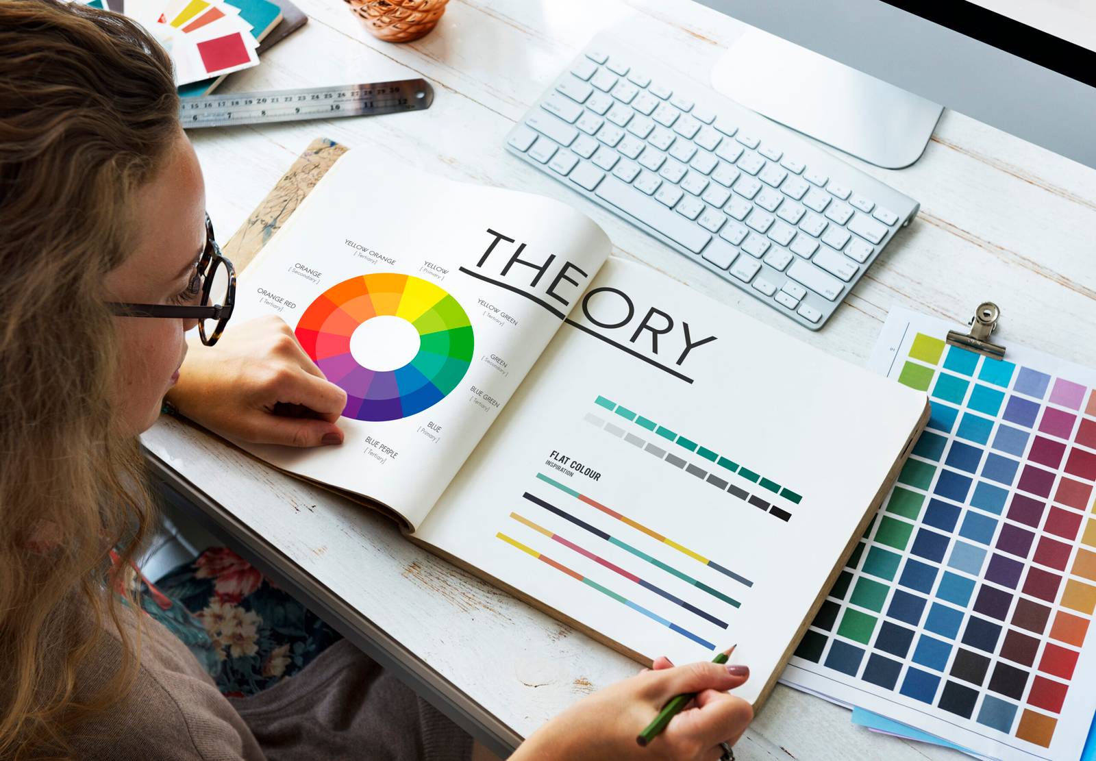
When you see a vibrant red sign, you might feel a sudden urge to buy something. When you look at a calming blue logo, you might feel a sense of trust. This isn’t a coincidence. It’s the power of Color Psychology in Graphic Design in action. In graphic design, color isn’t just a creative choice; it’s a strategic tool you use to influence emotions, perceptions, and even behavior.
Understanding how colors affect people helps you make better design decisions. It allows you to create a visual identity that connects with your audience on a deeper level. This article explores the fundamentals of Color Psychology in Graphic Design and shows you how to use it in your graphic design projects.
What is Color Psychology?
Color Psychology in Graphic Design is the study of how different colors affect human emotions and actions. Think about how you feel when you see certain colors. For example, red can make you feel excited or alert, while blue can make you feel calm and secure.
In marketing and branding, companies use Color Psychology in Graphic Design to create specific impressions and influence consumer behavior. Research shows that up to 90% of a person’s snap judgment about a product is based on color alone. This makes a brand’s color palette an incredibly powerful tool for attracting customers and building a strong identity.
While color associations can be influenced by personal experiences and culture, general meanings and feelings that colors evoke exist. You can use these general associations to create a brand that people instantly understand and trust.
The Meaning of Popular Colors
Every color has a story. By knowing what each color generally means, you can pick a palette that reflects your brand’s personality and values.
Warm Colors
Warm colors, like red, orange, and yellow, are energetic and passionate. They often grab attention and create a sense of urgency.
Red: 🔴 Red is a powerful color. It symbolizes passion, love, excitement, and urgency. Many fast-food brands use red because it can increase your appetite and create a sense of urgency. On the negative side, red also signifies danger and anger.
Orange: 🧡 Orange is a mix of red’s energy and yellow’s happiness. It feels friendly, enthusiastic, and creative. Brands often use orange to communicate warmth, affordability, and a playful vibe.
Yellow: 🟡 Yellow is a cheerful and optimistic color. It makes you think of sunshine and happiness. You can use it to create a feeling of warmth and joy. However, too much yellow can feel overwhelming or even cause eye strain.
Cool Colors
Cool colors, like blue, green, and purple, are often calm and peaceful. They can make you feel relaxed and secure.
Blue: 💙 Blue is one of the most popular colors for brands. It symbolizes trust, professionalism, stability, and calmness. Many banks, tech companies, and financial institutions use blue to build confidence with their customers.
Green: 💚 Green has a strong connection to nature and health. It represents growth, freshness, and tranquility. You can use it to promote a brand that is organic, sustainable, or environmentally friendly. It also has associations with wealth and money.
Purple: 💜 Purple traditionally represents royalty, luxury, and wisdom. It also has a creative and imaginative feel. Lighter shades of purple can feel soothing, while darker shades can feel more elegant and sophisticated.
Neutral and Other Colors
Neutral colors are the backbone of many design palettes. They provide balance and a professional feel.
Black: 🖤 Black is powerful, elegant, and sophisticated. Brands use it to communicate luxury, authority, and mystery. Black provides a great contrast for brighter accent colors.
White: 🤍 White represents purity, simplicity, and cleanliness. It’s an excellent choice for minimalist designs because it makes other colors stand out and creates a sense of space.
Brown: 🤎 Brown is an earthy color that symbolizes ruggedness, reliability, and warmth. Many food or outdoor brands use brown to feel authentic and dependable.
Pink: 🩷 Pink is often associated with romance, femininity, and softness. It can be playful and sweet, and you often see it used in products for children or in brands that want to feel charming.
Using Color Psychology in Your Designs
Knowing what colors mean is just the beginning. You have to use them effectively to create a cohesive and impactful design.
Pick a Color That Fits Your Brand: The most important rule of Color Psychology in Graphic Design is that your chosen colors must be appropriate for your brand’s personality. If you are a financial advisor, using a playful pink might not be the best choice. A professional blue or gray would work better. If you are a children’s toy company, those playful colors would fit perfectly.
Create a Color Palette: Don’t just pick one color. Choose a main color and a few secondary colors that work well together. A good palette uses a mix of warm and cool colors or a few shades from the same family to create harmony. A classic trick is to use a bright accent color to draw attention to important elements, like a “Buy Now” button.
Stay Consistent: Use the same colors across all your marketing materials—your website, logo, social media posts, and Color Psychology in Graphic Design. Consistency builds brand recognition and trust. When people see your colors, they should immediately think of your brand.
Test Your Colors: Color Psychology in Graphic Design perception is not an exact science. Cultural differences and personal preferences can change how people react to a color. You can test your color choices with your audience to see what they respond to. For example, you might try A/B testing two different landing pages with different button colors to see which one gets more clicks.
Recommended Posts

Graphic Design Trends in the Canadian Tech Industry
September 26, 2025

The Best Graphic Design Programs at Canadian Universities
September 25, 2025

Social Media Marketing Trends for Canadian Businesses
September 19, 2025
